

Why Your Dining Room Deserves Better Than Guesswork
Great lighting can change how you eat, talk, and feel—tonight. Your pendant light supplier should help you achieve that, not make you gamble with glare. When you search for the best pendant light for dining room, you’re not just buying a shape; you’re buying comfort, clarity, and control (yes, even in a small room). Here’s the kicker: more than half of buyers misjudge sizing, lumen output, or color temperature, and end up with harsh shadows or dim corners. So ask yourself: Are you choosing a pendant for the photo—or for the way the light actually works over food and faces? You can do better with a simple playbook. We’ll compare what most people do against what actually delivers results, using practical benchmarks like CRI, beam angle, dimmable drivers, and real photometrics. Ready to move from “looks nice” to “lives great”? Good—let’s step into the details and make each choice count.
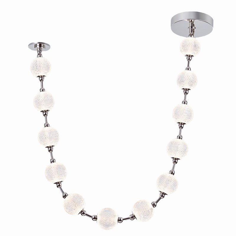
The Hidden Pain Points Behind “Best” (And How to Spot Them)
What are we missing?
Let’s go technical. Most “best” lists ignore context: table size, ceiling height, wall color, and background daylight. That’s why fixtures that look perfect online wash out your space or punch a glare hole across the table. The core pain point is mismatch—between the fixture’s beam angle and the room’s working surfaces. Another trap is poor dimming: if the drivers aren’t compatible with your wall dimmer, you get flicker or dead zones. Look, it’s simpler than you think. Ask for the lumens-at-source and lumens-at-plane (table height) if available. Check CRI 90+ for skin tones. Confirm CCT between 2700K–3000K for evening meals unless you host daytime brunches. And don’t let finish fool you—optics matter more than metal.
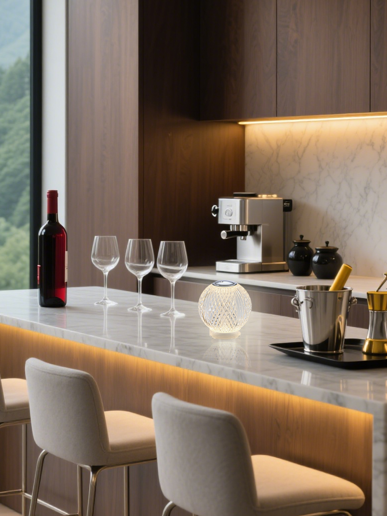
Traditional advice says “one pendant per four feet” or “odd numbers look better.” That’s not enough. What you really need is a glare index under control and a spread wide enough to reach plate edges without hotspots. If a supplier can’t share a basic photometric plot or beam diagram, that’s a red flag. You also want thermal management that protects LEDs from heat near the canopy—longer life, steadier lumen output. Bonus points for clear driver specs, not just “LED compatible.” Power converters and dimmable drivers should specify current, not just wattage. The difference shows up at dinner—no buzz, no flicker, no eye strain.
Next-Gen Choices: Turning Specs Into Real Comfort
What’s Next
Here’s the forward move: use fixture physics to get predictable comfort, then compare suppliers by how clearly they document it. Modern optics—microprism diffusers, edge-lit disks, and tuned beam shapers—turn the old “bright bulb under a shade” into even, low-glare light. That’s where quality acrylic pendant lights shine—literally. Acrylic diffusers can balance transmission and diffusion so faces look natural and the table gleams without sparkle burn. Pair that with constant-current drivers and proper thermal paths, and you get stable output across the dimming curve. Old-school glass can look great, but it often throws a hard edge without a secondary optic—funny how that works, right? The principle is simple: spread, soften, and control. Do that, and your “best” choice becomes repeatable rather than lucky.
Let’s compare outcomes. A bare-lamp pendant with a narrow beam may hit the centerpiece, then fall off fast, making food look dull at the rim. A well-designed acrylic optic with a 60–90° effective spread fills plates and faces evenly, even at 30–36 inches above the table—clean sightlines, minimal glare. One more thing—verify dim-to-warm options if you want that candlelit vibe without color shift artifacts. When a pendant light supplier provides photometry, driver specs, and mounting guidance, the install goes fast and the result feels natural. And if they show you line drawings with recommended spacing based on table dimensions—this is gold. It’s the bridge between spec sheet and supper table.
To wrap with practical guardrails, use these three metrics when you choose: 1) Photometrics you can trust—beam angle, lumens at table height, and a glare note if available; 2) Driver clarity—dimming protocol, current rating, and compatibility with your wall control; 3) Visual comfort—CRI 90+, a warm CCT range, and diffuser quality that avoids sparkle and hotspots. Keep those three tight, and style becomes the fun part—not the risky part. You’ll spend more time enjoying the meal and less time squinting at reflections—funny how a few numbers fix a lot, right? If you want a reliable reference point as you compare options, keep an eye on technical clarity and consistent documentation from brands like kinglong.